Understanding the difference between sections, columns and rows.
To begin editing sections, columns, rows and more first you’ll need to Login into your website using your user name and password.
Feel free to get in touch if you need further clarification on anything you are unable to achieve after viewing this video or reading the information below.
Sections, columns, rows and modules explained
Sections are the biggest
When building a site sections are the overarching element that encompasses all of the other items on a page.
A page will most likely be broken into several Sections that are stacked on top of each other. This allows for variation of design.
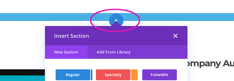
Divi has several section options to choose from.
When you click on the plus button at the bottom of a section a box will open. You will then be able to select from three section options.

Regular sections
Regular sections are indicated by the BLUE toolbar in the top left-hand corner. These sections are what you will mostly find on your website.

Specialty sections
Specialty sections are used when you are wanting to break up larger columns into smaller parts to create more complex layouts.
Once you’ve selected a specialty section you can create an enormous amount of flexibility within your website design.
These sections are indicated by an ORANGE toolbar.

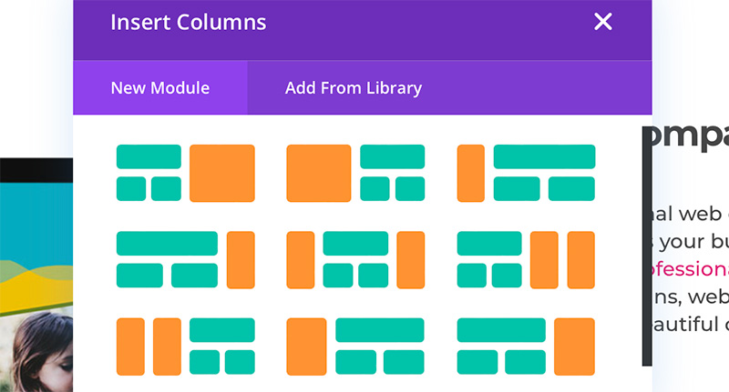
When you select a Specialty section a second Insert columns box will open offering variations of column layouts to choose from. The orange areas of the layout will only be able to contain modules stacked on top of each other. This is due to the area being unable to contain rows. In contrast, the green areas are able to contain the various row configurations available. By default, you can include up to three columns, not just the maximum of two indicated in the visuals.

Full-width sections
These sections are often found at the top of a page. They are indicated by a PURPLE toolbar. When a full-width section is selected a second box will open. Here you can select from a variety of full-width modules designed to spread the full width of the web page.

Rows are the next biggest
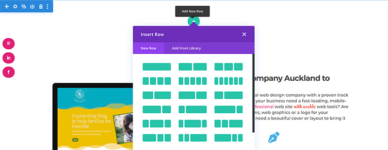
When you’ve added a Regular or Specialty section you’ll be prompted to add rows.
Because on most sites we use Regular rows most often this is what we will use to explain rows and how to use them. By default, Divi allows up to six columns in numerous configurations. Don’t worry about choosing the right row layout as this can easily be changed further down the track.

Rows are indicated by GREEN and have a GREEN toolbox in the top left-hand corner.
When you click on the cog you will be able to edit the setting for the contents of the row. The contents of the row will sit in containers called columns and the columns are easily edited from here.

Columns are divisions of the row
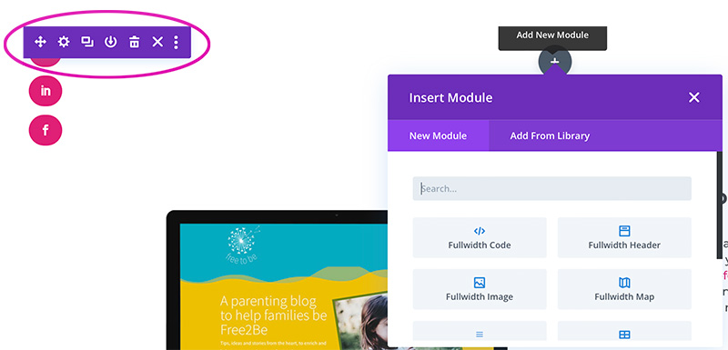
We selected a two-column format. As soon as you select a row format another box or window will open asking you to select a Module.
There are several ways to add a module:
- You can go ahead and close the box if you are planning to duplicate a module you already have on the page.
- If you know the module you want you can click the Add a new module tab and select the module by selecting the Add from library tab.
- You can select a pre-saved module.