Let’s learn how to make Divi mobile menu scroll on devices
Why would you need to know how to make Divi menu scroll on devices? Most of the time the mobile menu behaves perfectly in Divi. Now and then there is a scrolling issue on bigger devices that aren’t actual mobiles.
Here’s some background. When we use a mobile menu it is designed to collapse into the hamburger menu and pop open when the hamburger icon is clicked. The hamburger is the name often given to describe the icon with 3 horizontal lines. Traditionally used on mobile view, however, when a menu is long, we set the menu to be the mobile kind on narrow desktops and tablets too.
To fix this we add a few line of code to the CSS styles.
Divi > Theme Options > General > CSS

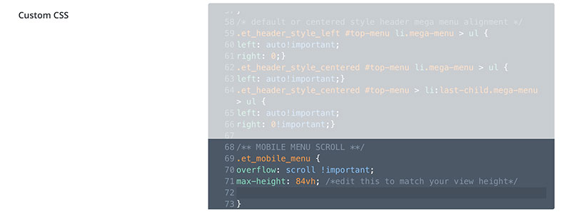
Copy and paste the code below into the CSS area on your Divi website.
We founds more information on this issue at Tompai Pro.
/** MOBILE MENU SCROLL **/
.et_mobile_menu {
overflow: scroll !important;
max-height: 84vh; /*edit this to match your view height*/
}
If we can help you with coding issues in Divi get in touch with us today.
Extra for experts
After applying this fix your long mobile menu should become scrollable, once opened.
This fix was applied and tested on Divi theme version 4.3.2.
There is also a solution to collapse the nested elements on the Menu if you prefer them to NOT all be visible.
You can find a video on that here.
We used code to correct the scrolling on the following sites:
