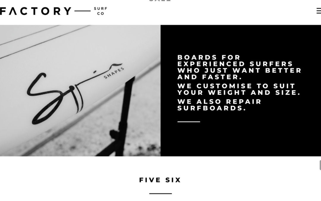
The icon used for a menu instead of a full menu is often called the ‘Hamburger’. This is used on mobile views. It can also be used if a menu is very long and busy or when a clean modern style is required.
The Divi default using the full screen view hamburger default is quite small. To increase the size I just added the following to the custom CSS area in the Theme Customiser or into the Divi Child theme CSS area.
Divi > Theme Options > General > Custom CSS
When to use the WordPress hamburger menu icon
The hamburger menu icon shows three stacked lines that open your navigation when tapped or clicked. It’s a simple way to save space on smaller screens. WordPress themes use media queries to switch layouts when the screen width drops below a set point. This is usually around 980px or 768px.
On mobile, the hamburger menu works well. It keeps the header clean and makes navigation easy to use. Visitors can focus on your content without clutter.
On desktop, it can be less effective. Hiding key pages behind an icon can lower visibility. It also adds extra clicks to reach pages. This can reduce engagement or confuse visitors unfamiliar with the icon.
Use the hamburger icon for small screens or minimalist designs. Keep your main menu visible on desktop to guide users clearly. This balance helps improve both usability and design flow.